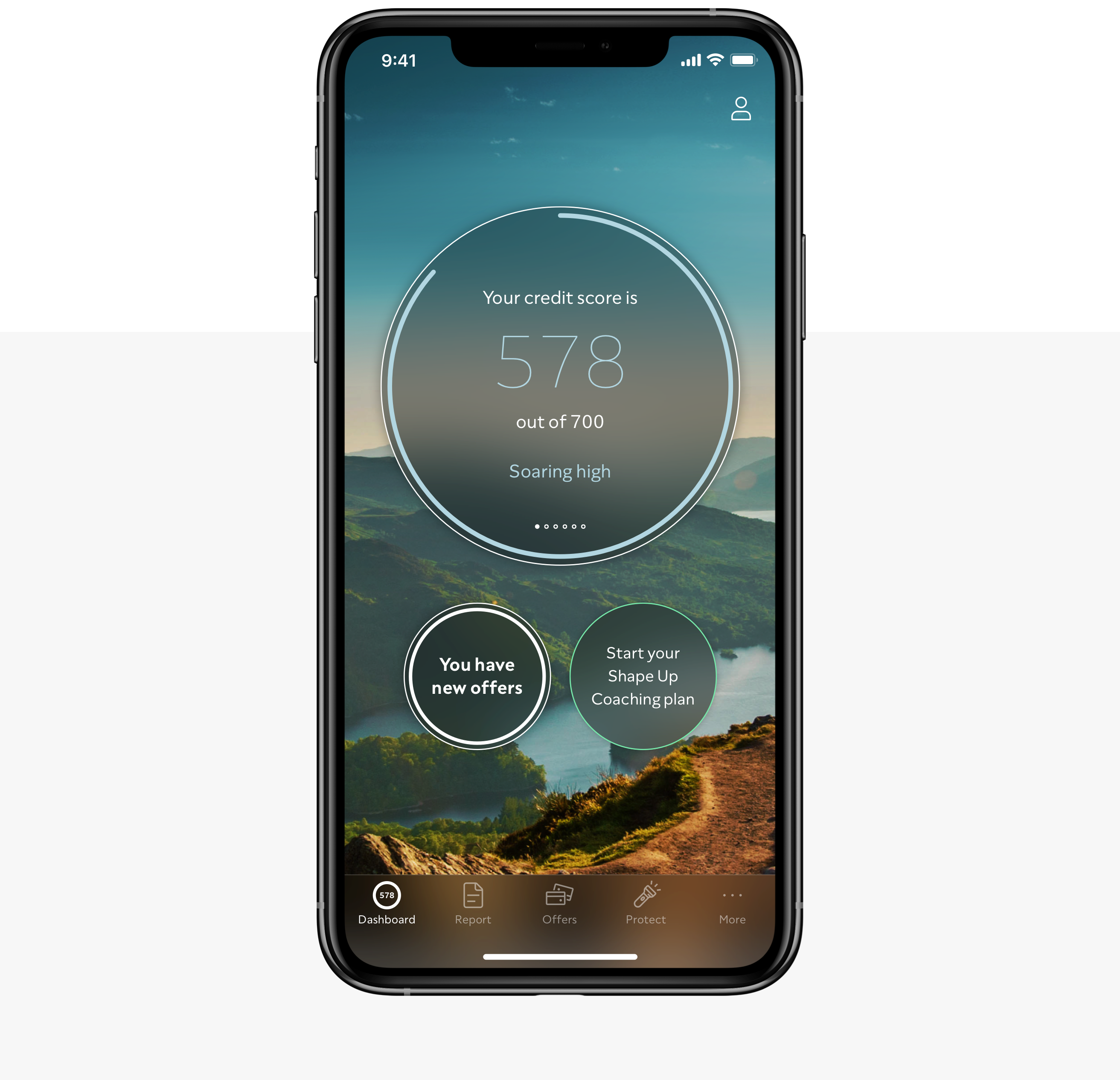
ClearScore is a leading FinTech business in the UK, aiming to change the way people manage their finances — starting with their credit score and report.
During my time here, I have worked within the Report & Offers squads, focusing on different areas of these very important parts of the ClearScore product.
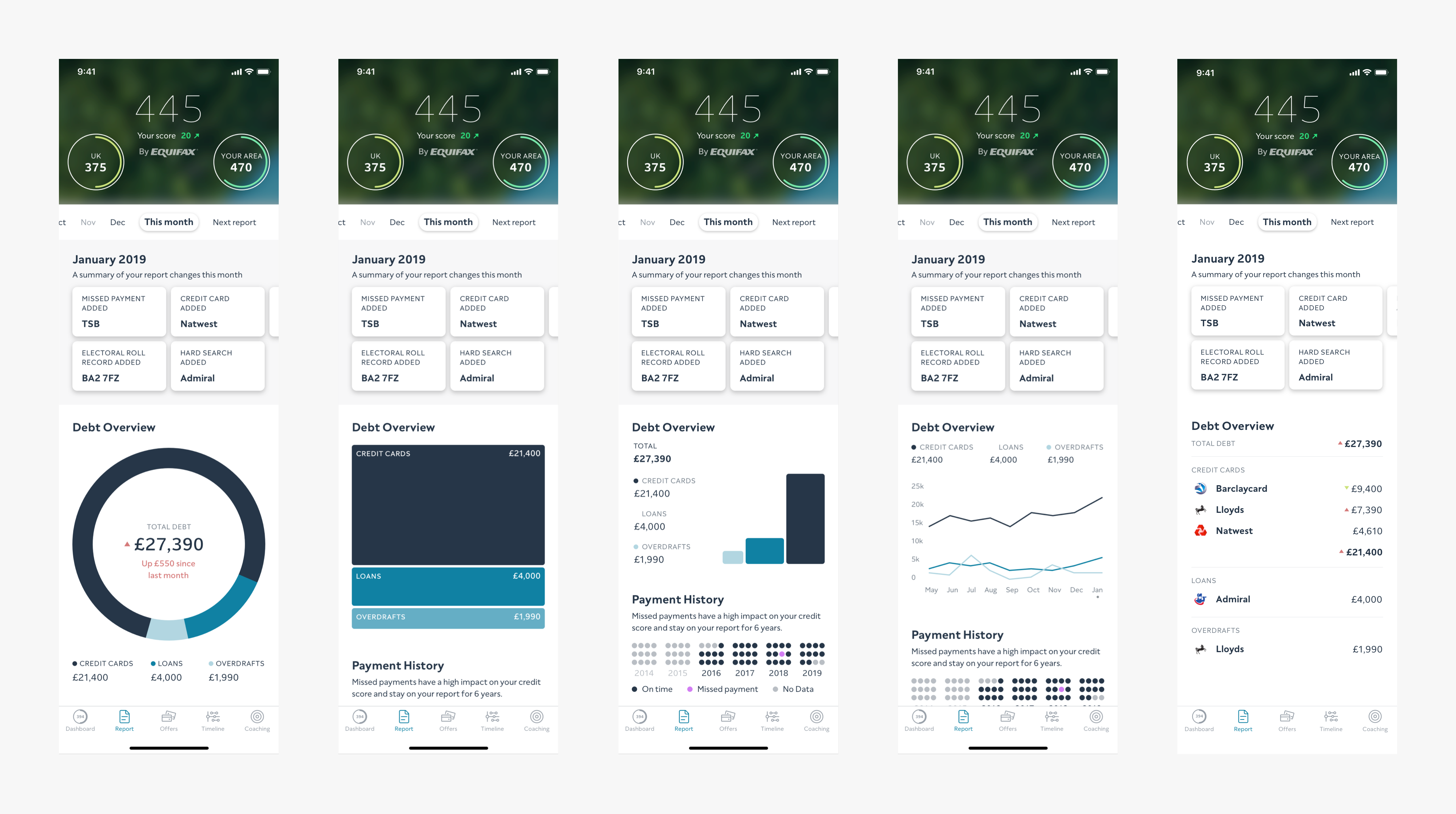
One of my projects within the Report squad was creating the debt overview component, providing users a look at their debt across multiple account types.
Debt Overview
Research had shown that users wanting to track their debt levels was one of the most requested features missing on the ClearScore app.
The feature had been developed previously, however, had tested poorly as users did not fully understand the visualisation shown, and that it was light on the detail they wanted to see.
I moved from reviewing this to wanting to understand ClearScore’s customers better and examining their approach to debt.
A series of interviews & surveys revealed that many users would like to track their debt levels, but do not currently do so outside of viewing their existing banking apps.
It also found that there would be interest in such a feature on ClearScore, especially if there was a relation between the user’s debt and their credit score.
Initial concept work
After I had a strong understanding of ClearScore customers’ motivations towards managing their debt, along with validation that the feature would be useful and ways in which it would be useful, I felt able to move into designing initial concept work (sketches at first, then interface mocks).
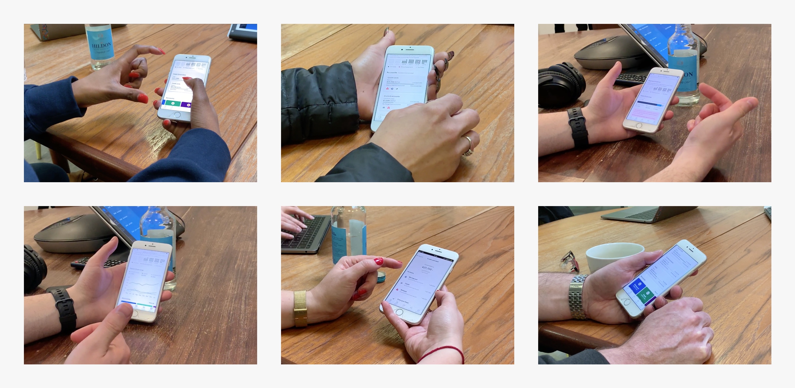
Testing & user feedback
User testing on these initial concepts was mixed, I went wide with my net of ideas that I wanted to test. I often find at this stage it’s good to test what doesn’t work, just as much as what does.
The initial concepts showed that there was an appetite from users to dive into the overview to get more information, and an understanding that any type of complicated graphs or visualisations while interesting to look at, don’t provide much value.
Narrowing down
I created some basic interactive prototypes to test the concept of having an overview, which would allow users to click deeper to see a breakdown of further account information.
Users responded very well to this approach and the minimalistic balance graph.
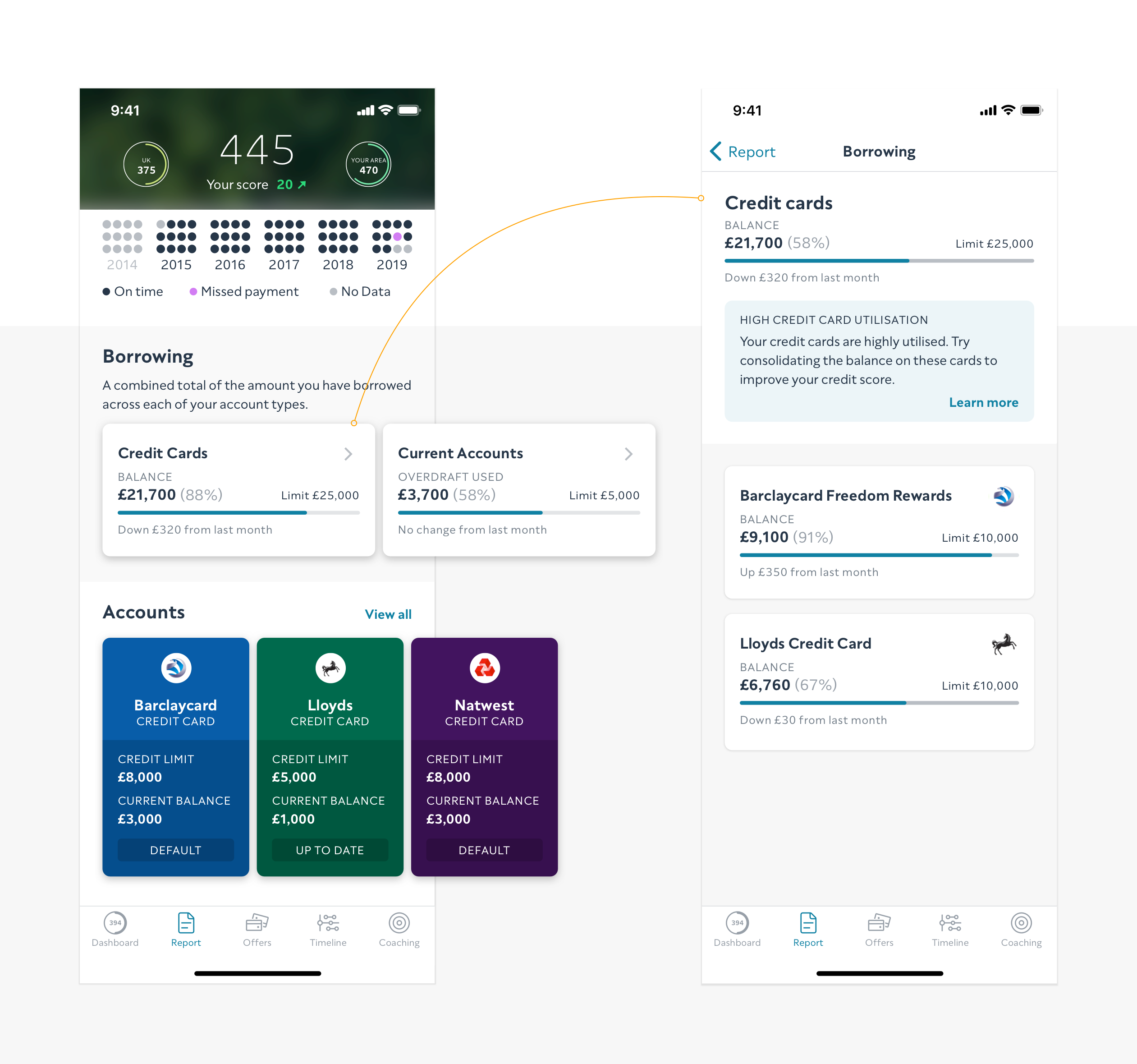
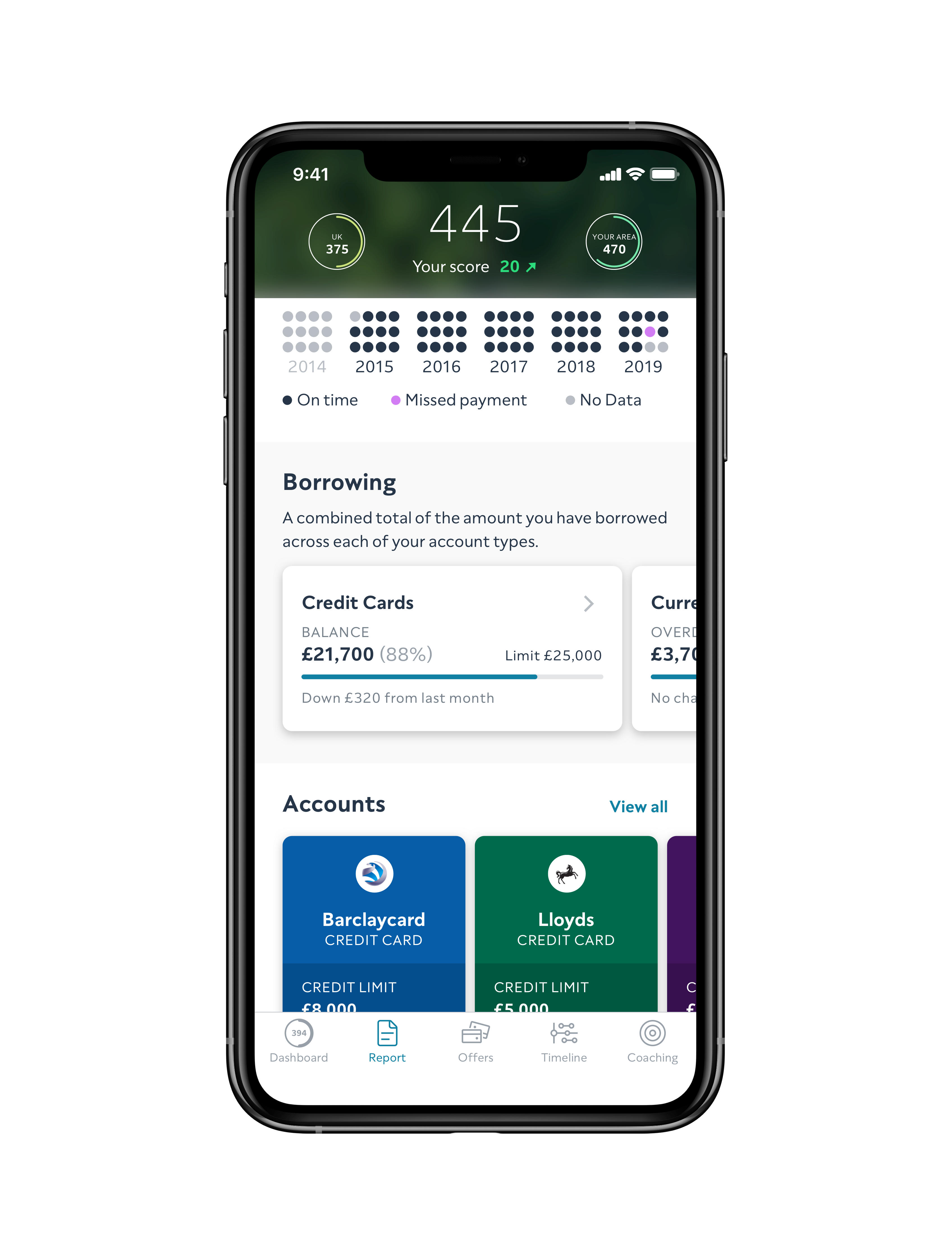
Borrowing
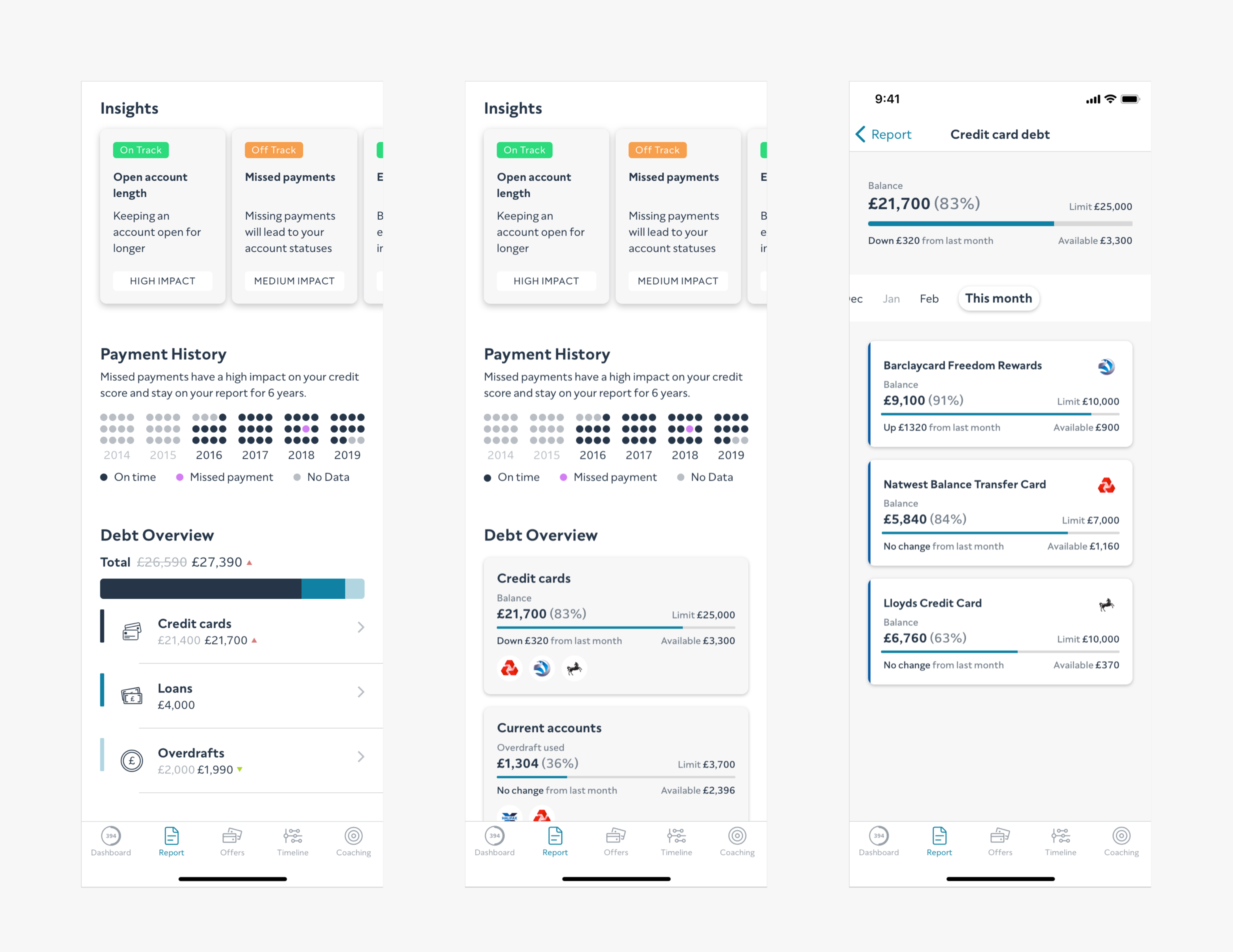
The final result, with its name now changed to borrowing, followed a similar carousel pattern that was already used and well-received by users within the Report.
The feature provides an overview of your debt level (balance/overdraft) across each of your account types (from credit cards to mortgages).
If the user wishes, they can then click into each of the account types to go forward to a detailed look at the accounts that make up the overall debt.
Helpful tips for users to improve their credit score also feature within this detail screen, based on the amount of debt the user carries.
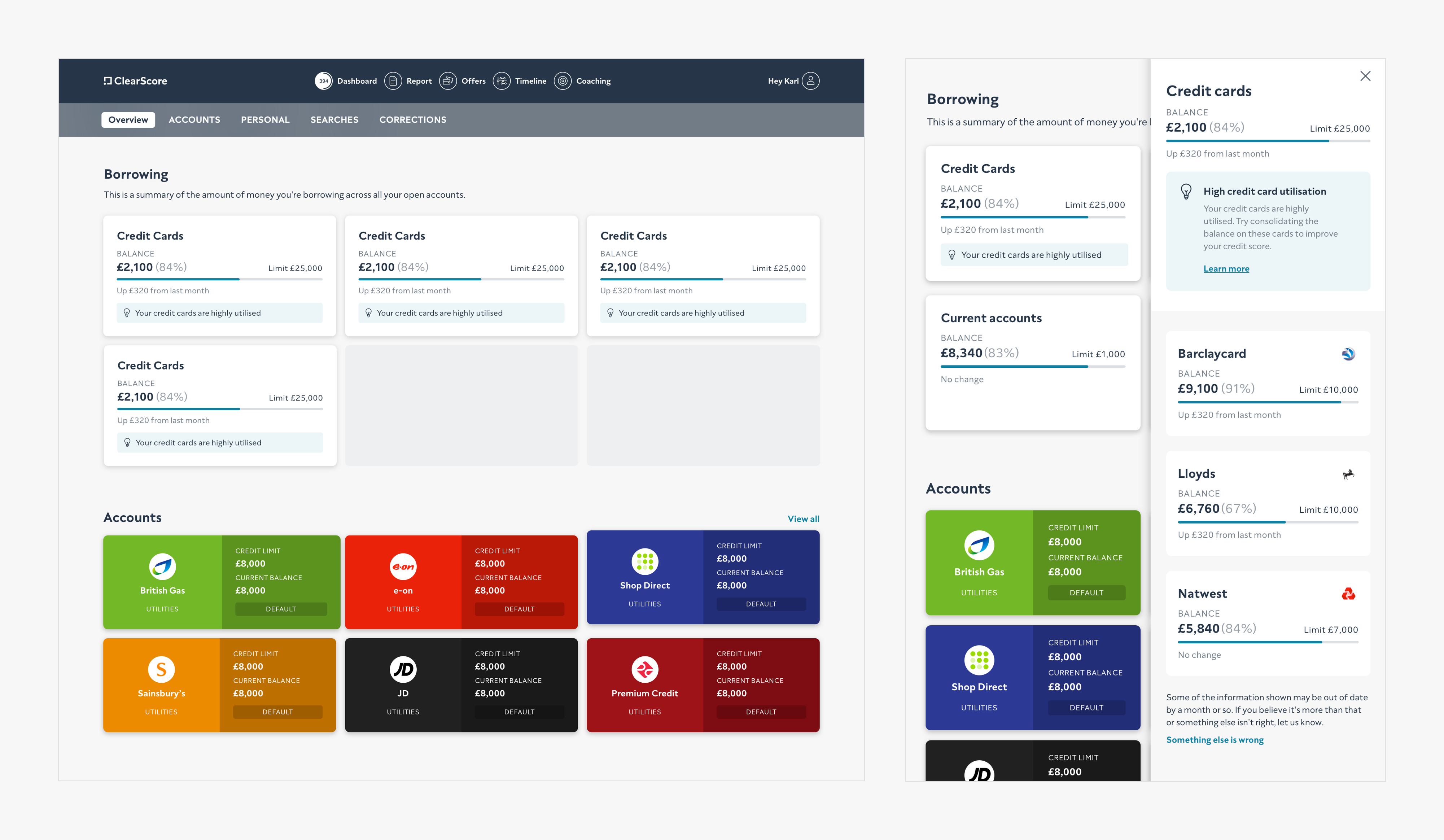
Web versions
Rollout & tracking
The feature was first rolled out to 10% of users on Android. After showing value e.g. increased engagement on the report, the feature was rolled out to 50% and then 100% of users. Soon after, the feature was launched on iOS & Web which resulted in similar performance.
One of the key metrics of the project was to increase conversion from the report screen to the offers screen (promoting positive action from users wanting to manage their debt by taking up useful financial products), the increase as of May 2020 was measured at 8.5%.
Following full rollout of this feature, I spent the time contributing this component and accessory components (💡 tip message) to ClearScore’s design system.
Glossary
Working document from Sketch.
Usability sessions